
Using responsive web design is an important way to design web pages, but it is not the only way. In fact, there are many different ways to create web pages that support both mobile and desktop layouts.
In this hour you will learn how to build web pages using several methods that are valid HTML5 and use modern techniques. All these methods can be used in conjunction with RWD, but they are also reasonable solutions on their own.
In this hour you will also learn about detection scripts and how to use them to detect browsers, devices, and objects on your web pages. This hour explains the benefits and drawbacks of these scripts and where to find good resources for using them.
Using table-based layouts is one of the oldest ways to design a web page layout. Before CSS was widely supported, one of the only ways to get even a mildly complex layout was to use HTML tables.
The basis of a table-based layout was, unsurprisingly, the table tag. The benefit of this method of web design is that it is well supported in many HTML editors and web browsers, so it can be very easy to put up. The secret is to turn off the borders, so that the table isn’t obvious.
With HTML5, using tables for layout is a valid way of designing web pages. You just need to tell the browser or user agent that the table is not data but rather design. Learn how to use this method in the following steps:
1. Design your web page on paper, in a graphics program, or in your head. In your prototype, be sure to show the borders of each section of your design. Figure 2.1 shows how you might define the tables on a sample web page.
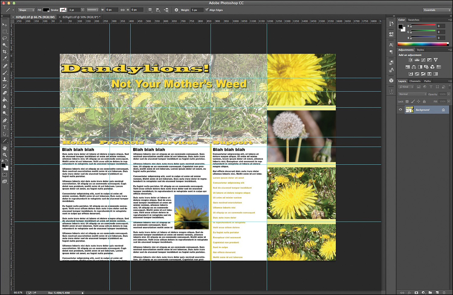
FIGURE 2.1 A preliminary layout with grid lines where the table should be.
2. Once you have your grid lines established, you should determine how the table cells should be displayed. Figure 2.2 shows the table cells in black lines above the guides.

FIGURE 2.2 A layout with the table cells defined.
3. Build the table by using the code in Listing 2.1. Note that the table in Figures 2.1 and 2.2 has five columns and eight rows, and Listing 2.1 reflects this.
LISTING 2.1 Basic Table for Layout
<!doctype html>
<html>
<head>
<meta charset="UTF-8">
<title>Basic Table for a Layout</title>
</head>
<body>
<table border="1">
<tr>
<td> </td>
<td> </td>
<td> </td>
<td> </td>
<td> </td>
</tr>
<tr>
<td> </td>
<td> </td>
<td> </td>
<td> </td>
<td> </td>
</tr>
<tr>
<td> </td>
<td> </td>
<td> </td>
<td> </td>
<td> </td>
</tr>
<tr>
<td> </td>
<td> </td>
<td> </td>
<td> </td>
<td> </td>
</tr>
<tr>
<td> </td>
<td> </td>
<td> </td>
<td> </td>
<td> </td>
</tr>
<tr>
<td> </td>
<td> </td>
<td> </td>
<td> </td>
<td> </td>
</tr>
<tr>
<td> </td>
<td> </td>
<td> </td>
<td> </td>
<td> </td>
</tr>
<tr>
<td> </td>
<td> </td>
<td> </td>
<td> </td>
<td> </td>
</tr>
</table>
</body>
</html>
The characters are non-breaking spaces used to hold the table cells open. They will be removed from the final table.
4. To tell browsers that this is a layout table and not tabular data, add the role="presentation" attribute to the <table> tag (for example, <table role="presentation">). It’s also a good idea to have your table take up the full width of the screen, so add a style to set that (for example, <table role="presentation" style="width: 100%;">).
5. Now things get challenging, and you need to start separating the rows and columns by using the rowspan and colspan attributes. The easiest way is to look at your mockup with the cells blocked out (Figure 2.2) and move from right to left across the columns. In this example, the first cell (with the headline “Dandylions!” in it) spans three columns. Add the attribute colspan="3" to the first <td> tag and then remove the following two <td> tags because they are now spanned by that first tag (for example, <td colspan="3">).
Note: Setting the Border Can Indicate a Layout Table
In order to make a layout table valid in HTML5, you need to indicate that it is a layout table rather than a table of data. To do this, you can use the role="presentation" attribute. Or, you can instead change the table border to zero, like this: border="0"; however, user agents can still misconstrue this, so it is better to use the role attribute.
6. As you move through the columns, bear in mind that some columns can span rows as well. On the first row, the final cell on the right with the large open dandelion spans three rows. So, to that <td> tag add the attribute rowspan="3" and then remove one <td> tag from the two following rows. Listing 2.2 shows how the HTML looks after all the row and column spanning attributes are added.
LISTING 2.2 Table for Layout Adjusted to the Design
<!doctype html>
<html>
<head>
<meta charset="UTF-8">
<title>Basic Table for a Layout</title>
</head>
<body>
<table role="presentation" style="width: 100%" border="1">
<tr>
<td colspan="3">Dandylions!</td>
<td> </td>
<td rowspan="3">Big Dandelion Pic</td>
</tr>
<tr>
<td> </td>
<td colspan="3">Not Your Mother's Weed</td>
</tr>
<tr>
<td colspan="4"> </td>
</tr>
<tr>
<td colspan="4"> </td>
<td rowspan="3">Seeded Dandelion Pic</td>
</tr>
<tr>
<td colspan="4">Navigation links</td>
</tr>
<tr>
<td colspan="2" rowspan="3">Column 1</td>
<td rowspan="3">Column 2</td>
<td rowspan="3">Column 3</td>
</tr>
<tr>
<td>Smaller Dandelion Pic</td>
</tr>
<tr>
<td>Field of Dandelions Pic</td>
</tr>
</table>
</body>
</html>
This listing shows that you can add some text in the cells so that you can remember what goes where in the design. You will replace this text with images and other HTML in the final design.
7. Add the images and HTML to the design. For this design, you need to cut the background image for the headlines into several pieces so that it will fit in the design. Figure 2.3 shows one way to split that image to fit in the design.

FIGURE 2.3 The background image cut up into table segments.
8. Finally, add the rest of the images and other HTML to your web page design. (I leave that for you to do on your own.)
After you’ve completed this Try It Yourself on your own design, you will have a web page that works in modern browsers. It is not a responsive design, but it is valid HTML5.
Video 2.1. Build a Simple Table-Based Layout
The biggest problem with using tables for layout is that they form a very rigid design. Many older cell phones don’t display tables, or if they do, they force the designs to scroll horizontally. And many cell phones other than smart phones don’t scroll horizontally at all.
Note: What Is the Relative Position Style?
You may have noticed in the preceding Try It Yourself that some of the elements have the property position: relative; rather than position: absolute;. That is because they are elements that are inside other absolute positioned elements.
The position: relative; property tells the browser to treat the origin point as the upper-left corner of the current element rather than as the upper-left corner of the browser.
Using CSS is the modern way of creating a web design layout, but many people find it more difficult to understand than table-based design. There are two main ways to create layouts with CSS: CSS positioning and CSS floats.
CSS positioning is often the first place beginning designers start when learning CSS layout because it is easy to understand. With CSS positioning, you treat a web page like it’s a paper layout. You decide where you want each individual element and then you position it on the page based on an x,y grid, starting in the upper-left corner. This is called absolute positioning.
To use absolute positioning, you use two or three CSS properties. The first property is the position style property. This tells the browser that the element is going to be positioned in some way on the page. To specify absolute positioning, you use the value absolute (for example, position: absolute;).
Then you define where the element will be placed on the screen by using the properties top and left. For example, if you want an element placed at the upper-left corner of the screen, you add the styles top: 0px; and left: 0px; to your style sheet.
CSS positioning allows you to be very explicit about where various elements go on a web page by letting you place them exactly where you want them. In this tutorial you will take the same design you used for the table layout and lay it out by using CSS positioning:
1. Design your web page on paper, in a graphics program, or in your head. In your prototype, make note of the x and y positions for the various elements in your design. Figure 2.4 shows the positions for a few of the elements in this design.

FIGURE 2.4 The design with the positions of some of the elements indicated.
2. Open your HTML editor and add the <div> elements you need to create the web page. Listing 2.3 shows the HTML for this.
LISTING 2.3 HTML Layout with Absolute Positioning
<!doctype html>
<html>
  <head>
    <meta charset="UTF-8">
    <title>Using Absolute Positioning</title>
  </head>
  <body>
    <header id="banner">
      <h1>Dandylions!</h1>
      <h2>Not Your Mother's Weed</h2>
    </header>
    <nav>
    Navigation Links
    </nav>
    <article id="column1">
    </article>
    <article id="column2">
    </article>
    <aside id="column3">
    </aside>
    <aside id="rightcol">
      <div id="bigflower"></div>
      <div id="seededflower"></div>
      <div id="closeup"></div>
      <div id="field"></div>
    </aside>
  </body>
</html>
3. Add your CSS to the HTML, either as an internal style sheet using <style> tags or as an external document.
4. For each element to be positioned, include both the width and height as well as the position location. Listing 2.4 shows my CSS styles.
LISTING 2.4 CSS for Absolute Positioning
#banner {
  width: 1200px;
  height: 500px;
  position: absolute;
  top: 0px;
  left: 0px;
}
h1 {
  position: relative;
  top: 24px;
  left: 7px;
}
h2 {
  position: relative;
  top: 24px;
  left: 201px;
}
nav {
  width: 1200px;
  height: 45px;
  position: absolute;
  top: 500px;
  left: 0px;
}
#column1 {
  width: 412px;
  min-height: 700px;
  position: absolute;
  top: 545px;
  left: 0px;
}
#column2 {
  width: 466px;
  min-height: 700px;
  position: absolute;
  top: 545px;
  left: 412px;
}
  #column3 {
  width: 322px;
  min-height: 700px;
  position: absolute;
  top: 545px;
  left: 878px;
}
#rightcol {
  width: 400px;
  min-height: 1312px;
  position: absolute;
  top: 0px;
  left: 1200px;
}
#bigflower, #seededflower, #closeup, #field {
  width: 400px;
  height: 328px;
  position: relative;
  top: 0px;
  left: 0px;
}
5. Add your text and other styles to finish the document.
You can cut up the background image similarly to how you cut it up in the Try It Yourself “Build a Simple Table-Based Layout.”
Video 2.2. Create a Layout Using CSS Positioning
The biggest problem with using CSS positioning for creating web pages is that it creates a very static layout. For example, the site you built in the above two Try It Yourself sections is 1600 pixels wide. This will look fine in a wide-screen device, but it will be hard to read in smaller devices.
A more flexible CSS layout relies on the CSS float property to take elements out of the normal web page flow and let them slide to their position naturally.
When you apply the float style property to an HTML element, such as an image, it is removed from the normal flow of the HTML and floated to either the left (float: left;) or the right (float: right;). The HTML content following it is still in normal flow, so it ends up wrapping around the floated image. Figure 2.5 shows an image with a paragraph of text displayed in normal flow and then with the image floated to the left.
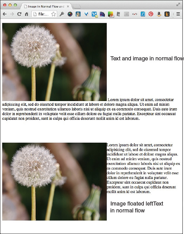
FIGURE 2.5 An image in normal flow and floated left.
Note: What Is Normal Flow?
When you build an HTML web page, normal flow is how the browser displays the contents absent any style or positioning directions. Web browsers display the contents of web pages in the order they appear in the HTML document, and they allot them as much space as they need. In other words, a paragraph of text will take up 100% of the browser width and as much vertical space as it requires.
Most web designers use normal flow by placing the content they want at the top of the page first in the HTML and the content they want at the bottom last in the HTML.
In the figure, the same image and text are placed in the HTML. The only difference is that the second image has the float: left; style property set on it. As you can see, when an image is in normal flow, any text following it inline is positioned to the right of the image, at the very bottom.
Web designers use the float property to position entire blocks of text and images on a page.
To work with CSS floats for design, you also need to know about the clear property. This property stops the float and moves all content to below the floated element. For example, Figure 2.6 shows a floated image with two paragraphs following it, but only the first paragraph is alongside the image.
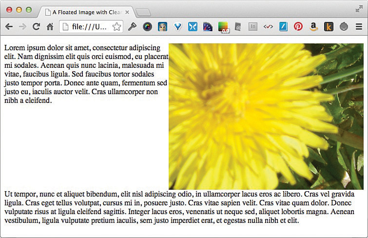
FIGURE 2.6 A floated image with two paragraphs, the second of which is cleared.
The best reason to use CSS float for design is because it is more flexible than other methods. But there are some problems with using just floats for web design. In Figures 2.5 and 2.6, if the browser window is narrower, it can make the text lines very short and hard to read. Floated designs are also very hard to build because they flex and change depending on how much space is available for the non-floated elements. You can alleviate this by setting widths on every element, but if you set explicit widths, you run into the same problems as with CSS positioning and table-based layouts.
Caution: You Must Use Browser Prefixes for the Column Properties
As of this writing, the CSS3 column properties work in all modern browsers. But they work only if you use browser-prefixed versions of the properties. These are the prefixes:
-moz--ms--o--webkit-You should add the browser-prefixed versions first in your CSS and follow them all with the official property. That way the cascade will apply the official property last and keep your web pages up-to-date.
Modern CSS, and specifically CSS3, gives web designers another very powerful tool for creating interesting web designs: CSS columns or multicolumn layout. CSS multicolumn layout recognizes that most web designs are really just columns of different widths. With CSS3 column properties, web designers can create columns that flow depending on how much content there is but still remain in multiple columns defined by the designer.
You can use 10 CSS3 properties to define columns on web pages:
By using the CSS3 column properties, you can create a web page with a lot of content that flows through the columns much as a newspaper layout does. Figure 2.7 shows the four-column layout created in Listing 2.5.
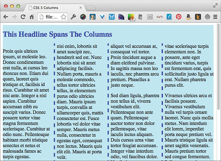
FIGURE 2.7 A four-column layout using CSS3 columns
LISTING 2.5 Four-Column Layout with CSS3
<!doctype html>
<html>
<head>
<meta charset="UTF-8">
<title>CSS3 Columns</title>
<style>
#columns {
  width: 100%;
  background-color: #BBF0F9;
  -moz-column-count: 4;
  -webkit-column-count: 4;
  column-count: 4;
  -moz-column-rule: 4px dashed blue;
  -webkit-column-rule: 4px dashed blue;
  column-rule: 4px dashed blue;
}
div h1 {
  color: blue;
  font-size:x-large;
  -moz-column-span: all;
  -webkit-column-span: all;
  column-span: all;
}
</style>
</head>
<body>
<div id="columns">
  <h1>This Headline Spans The Columns</h1>
  <p>Proin quis ultrices ipsum, ut molestie leo. Donec erat nulla,
  at cursus leo rhoncus non. Etiam dui quam, laoreet et, facilisis
  id risus.</p>
  <p>Quisque ac urna id vehicula iaculis. Nam turpis libero, pulvinar
  faucibus quam suscipit, fringilla semper mi. Quisque cursus tortor,
  non ullamcorper metus accumsan vitae.</p>
  <p>Aliquam sodales volutpat turpis, laoreet ultricies dolor egestas nec.
  Vestibulum vitae tortor massa. Maecenas ultrices consectetur adipiscing.
  felis pretium, pulvinar risus sed, venenatis nunc.</p>
  <p>Sed diam ligula, pharetra non tellus id, viverra vestibulum elit.
  Pellentesque non ante quam. Pellentesque auctor tortor non dolor,
  vitae iaculis lectus aliquam.</p>
  <p>Vivamus ultrices arcu et facilisis posuere. Vivamus nulla vel
  turpis ornare laoreet. Nunc quis mollis metus. Nam interdum lorem,
  imperdiet porta neque pretium vel.</p>
</div>
</body>
</html>
The advantage to using CSS3 columns in web page layouts is that they can readily adjust to fit the browser window width. In Listing 2.5, I set the width on the container element (<div id="columns">) to 100% so that the layout would flex with the width of the browser. I did not set any column widths so that the browser could make four equally spaced columns.
But this raises a concern with using CSS3 columns for layout. On a narrower browser, such as a smart phone in portrait mode, layouts with more than three or four columns can be very hard to read. The text can get very squished. You can see this in Figure 2.8, with the Chrome browser resized down to its narrowest width.
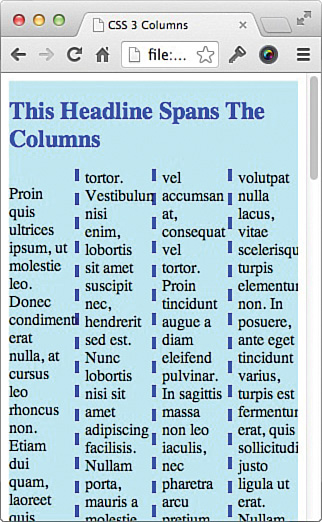
FIGURE 2.8 A four-column layout in Chrome, with the browser resized to its narrowest width.
Detection scripts are scripts usually written in JavaScript or PHP that detect something in the web browser or device viewing the page. They provide fallback programming or even redirect a customer to a completely different page or website.
One of the most common ways that web designers create web pages that work on mobile as well as desktop devices is through browser detection scripts. The idea behind these scripts is that most web browsers and devices send a signature to the web server that the designer can use to tailor the web page to fit that browser.
On the surface, this sounds like a good idea. If you know that Android phones don’t support some feature you want to have on your site, you can detect those phones and give them an alternative.
But browser detection scripts have a huge problem: There are hundreds if not thousands of different browsers. And to make matters worse, not all browsers send unique signatures. In fact, some browsers have been known to send false and misleading browser information so that web designers won’t block those browsers.
One way to deal with the problems caused by browser detection scripts is to use a program for mobile detection. This script looks at the device requesting the page, and if it’s a mobile device, like a phone or tablet, does something different than if it’s a computer.
One script that is very easy to use is from Detect Mobile Browsers (http://detectmobilebrowsers.com). You can download a script and use it to detect many different kinds of mobile phones and tablets. The script lets you do different things for each device, including redirecting users to a new web page.
Another tool that is harder to use is WURFL (Wireless Universal Resource FiLe; http://wurfl.sourceforge.net). The WURFL file is a huge repository of devices that is updated regularly to include more mobile devices. It is delivered as an XML file that a web developer can mine to display web pages to very specific devices. This tool is helpful for web designers who need to get very granular in their device detection, but it is harder to use than Detect Mobile Browsers.
Mobile detection suffers from the same problem as browser detection in that there are hundreds or thousands of different mobile devices in use. Detecting for most of them (as WURFL attempts to do) can result in slower pages, while not impacting a large number of customers. However, if you’re building a website for the mobile industry, it might make sense to be able to detect exactly what device a customer is using.
Using object detection is the best way to create fallback options for browsers and devices because it doesn’t rely on the device or browser to report accurately what it is. Instead, object detection looks at what the device or browser can do and builds a web page around those capabilities.
For example, HTML5 offers the ability to create offline web applications using the applicationCache object on the window or global element. This is useful for creating web applications that don’t have to be always online. But you can store information offline only if the browser supports it. Listing 2.6 shows you how you can detect for that object and then provide fallback information when it doesn’t exist.
LISTING 2.6 Simple Object Detection Script
if (window.applicationCache) {
  document.write("Browser supports offline web apps");
} else {
  document.write("Browser does not support offline web apps");
}
As you can see, this JavaScript script uses the document.write function to show where you’d place your actual functions using the applicationCache and the fallback functions when it isn’t available. This script does not need to know what browser or device is viewing the page, just whether the required object is available.
The primary drawback to using object detection is that it assumes that you will know which object is most likely to fail. If you aren’t sure which object is most likely to fail, it can be tempting to create scripts that have fallback options for even the most basic objects. While this will make your web pages more compatible with older browsers and devices, the number of people using those browsers is very small, and so the return for the effort required will be small, too.
In this hour, you’ve learned about some of the alternatives to RWD that web designers use. You’ve learned about table-based designs and some of the pitfalls of this technique. You’ve also learned how to use CSS positioning and floats to create layouts that are laid out with extreme precision or a more flexible format. This hour introduced the CSS3 concepts of columns, and you’ve learned how to use these new properties to create a newspaper-like layout (see Table 2.1).
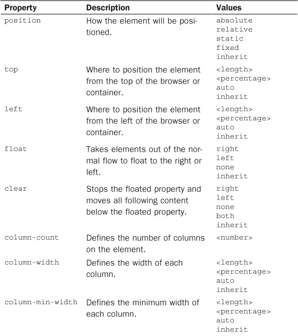
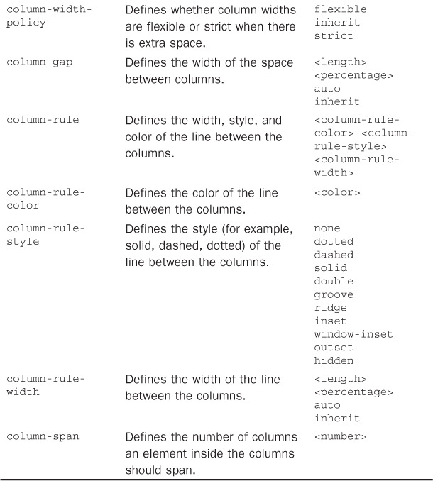
TABLE 2.1 CSS Properties Covered in Hour 2
In this hour, you’ve also learned about alternatives to RWD that take the browser or device into consideration, using scripts to detect various features. Browser detection, device detection, and object detection are all good solutions, and while there are certain drawbacks to each, each can serve a purpose.
Q. You mention the term user agent in this lesson, but what is a user agent?
A. User agent is often used interchangeably with the term web browser, but it includes any device or program that can view a web page, not just web browsers. For example, some scripts can visit a web page and grab the contents for reading offline. These are not technically web browsers, but they view the page contents and are therefore user agents.
Q. Is it really a good idea to use CSS3 columns if they aren’t supported without browser prefixes?
A. If you create your CSS with the CSS3 property last, this will act as a fallback itself. Because the cascade walks through the CSS in order, the last property the browser supports will be the one that is used. When you use browser prefix versions, you are acknowledging that some browsers have not fully implemented the standard (by using the official property), but they do support it. This also allows you to decide what you want to support. For example, if you don’t want Internet Explorer to display the columns until it’s fully compatible, then you just leave off the -ms- prefixed version of the style.
Q. You seem to feel that detection scripts are bad. Why is that?
A. I don’t think all detection scripts are bad, but I think they give designers a false sense of security. If you are using a mobile detection script to send all mobile phones to a different site, and a new phone comes out that your script doesn’t detect, you may think your site is perfect when some customers aren’t getting an ideal solution. In contrast, when you use object detection scripts, you don’t have to continually update your scripts for new devices or browsers. You just detect for the objects your site is using and leave it at that.
1. Take a look at the web page you decided to work with in Hour 1, “What Is Responsive Web Design?” and decide if it already uses any of the methods described in this lesson: tables for layout, CSS positioning, CSS floats, CSS columns, or detection scripts. Remember that a web page can use any combination of these tools at any time and is not limited to just one.
2. Once you know what the site is using, evaluate how well it’s using those tools. For example, if it’s using tables for layout, does it have the role=presentation attribute set? Does it use the correct browser prefixes? Is it detecting objects or browsers? If you find errors or problems, correct them.
3. Many designers find that CSS float layouts are often the easiest to convert to RWD. If the site you’re working with doesn’t already use that style of layout, create a new version using CSS float. If you need more help doing this, see my article “Using the CSS Float Property” on my website (www.html5in24hours.com/2014/09/using-css-float/).