
Responsive web design (RWD) is an approach to web design that attempts to adapt a site’s design for optimal viewing on all of a customer’s devices. RWD helps web designers and site owners create an “edit once, display anywhere” website. The web designer builds one page that can then be viewed on a wide-screen desktop or a small-screen cell phone without requiring the user to open another site or page. Instead, the content on the page moves around in the design to suit the device being used to view the page.
A website that uses responsive design changes the layout of the website depending on what device is viewing it. But unlike older solutions, RWD does not use scripts or programming to achieve these changes. Instead, RWD uses Cascading Style Sheets (CSS) media queries (more about this in Hour 10, “CSS Media Queries”) to define fluid grids, variable font sizes, and flexible images. The media queries define what styles will apply to the design, based on the device being used to view it.
When web pages were first being built back in the mid-1990s, most people building them were not designers. Those website builders cared a lot less about how the page looked than if the content was displaying at all.
The first signs of design starting to have some sway were when someone invented the technique that is now called “the single-pixel GIF trick.” This is where you create an image that is 1px by 1px and transparent. Because it is a transparent GIF, it isn’t visible on websites and so can be used for spacing content. As you can see in Figure 1.1, when you use a transparent GIF, you can indent paragraphs without using CSS.
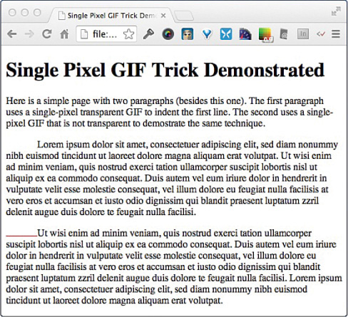
FIGURE 1.1 How the single-pixel GIF trick works.
Caution: There Are Better Tools Than the Single-Pixel GIF Trick
The following code listing for the single-pixel GIF trick is provided for interest only. I strongly recommend that you use other techniques, such as CSS, for managing indents. If you don’t know CSS, find one of the many great books out there to help you learn, including Sams Teach Yourself HTML and CSS in 24 Hours by Julie Meloni.
This trick was important because CSS wasn’t around yet, and web designers didn’t have any other way to style or position content on web pages. Web designers used the trick to give paragraphs of text an indent on the first line. But it was also used to move content around on the page. This trick was revolutionary back then as it gave web developers a way to position text and move things around in a way we didn’t have before. Listing 1.1 shows the HTML used to create the page in Figure 1.1.
LISTING 1.1 Demonstrating the Single-Pixel GIF Trick
<!doctype html>
<html>
    <head>
    <meta charset="UTF-8">
    <title>Single Pixel GIF Trick Demonstrated</title>
    </head>
<body>
    <h1>Single Pixel GIF Trick Demonstrated </h1>
    <p>Here is a simple page with two paragraphs (besides this one).
    The first paragraph uses a single-pixel transparent GIF to indent
    the first line. The second uses a single-pixel GIF that is not
    transparent to demonstrate the same technique. </p>
    <p>
    <img src="images/single-pixel-transparent.gif" width="50"
    height="1" alt=""/>Lorem ipsum dolor sit amet, consectetuer
    adipiscing elit, sed diam nonummy nibh euismod</p>
    <p>
    <img src="images/single-pixel.gif" width="50" height="1"
    alt=""/>Ut wisi enim ad minim veniam, quis nostrud exerci
    tation ullamcorper suscipit lobortis nisl ut aliquip ex ea
    commodo consequat. Duis autem vel eum iriure dolor.</p>
</body>
</html>
As you can see, by changing the size with the width and height attributes on the single-pixel images, you could control the size of the indent.
Video 1.1. Seeing the Single-Pixel GIF Trick in Action
Note: Switchy McLayout Was One of the First Adaptive Designs
Back in 2006, the online magazine A List Apart ran the article “Switchy McLayout” (http://alistapart.com/). This article explained how to use CSS media queries to create pages that adapted depending on what browser media was viewing it. This was cutting edge at the time, and only a few desktop browsers recognized media queries, let alone mobile devices. It took a few more years for this type of design to catch on.
issue/229
Once CSS came on the scene in the mid-1990s, doing design and layout on websites became a little easier. However, CSS level 1 (CSS 1) was fairly limited to just fonts and colors, and it also wasn’t widely supported by browsers at first.
CSS 1 was completed as a specification in 1996, but it didn’t gain browser traction until 2000, when Internet Explorer 5.0 for Macintosh came out with support for more than 99% of CSS 1. CSS 1 was pretty limited when it came to layout, only supporting aligning text, floating elements, and some box properties (like margins, padding, and borders).
CSS level 2 (CSS 2) came out in the early 2000s, and that’s when web designers finally started getting support for layout and positioning of elements on a web page. CSS 2 added properties like position and z-index. With these properties, web designers could place elements wherever they wanted on the page, including “offscreen” where the elements couldn’t be seen at all.
CSS level 3 (CSS3) paved the way for responsive web design. While media queries were first introduced into CSS in level 2, CSS3 media queries came out as a candidate recommendation in 2002, and by 2012 most web browsers and mobile devices supported media queries.
Media queries allow a web designer to create separate CSS documents for devices with different media features. The most commonly used feature is the browser width. For example, a small smartphone might have a width of 640px, while a widescreen monitor might have a width of more than 2000px. With media queries, you can detect that and build designs to suit each size. You will learn more about media queries in Hour 10.
While media queries are the basis of responsive web design, it wasn’t until 2009 that designers realized that they could use them to develop adaptive websites. Instead, many designers went down a completely different path and created completely separate websites and pages for different browsers and devices.
In the early days of mobile devices and smartphones, it was very common to visit a website on a mobile device and be forced to a “mobile-friendly” version of the site. Often these mobile sites had completely different URLs as well as layouts and even content. Web content owners didn’t want to have to maintain two separate sites, so often the mobile site would be left with minimal content, while the primary site business was conducted on the desktop version of the site.
Video 1.2.Switchy McLayout
Mobile-specific websites became very popular a few years later, and almost every website with any mobile customers started using this method to support mobile customers. They often used server-side and local scripts to detect the device being used and redirect the customers there. Some of the sites allowed customers to choose, but most relied on the scripts to direct readers to the “correct” site. But these started losing favor with customers when it became apparent that the mobile versions of the sites were minimal or ignored.
Then in 2010, web designers started discussing the benefits of “graceful degradation” and “progressive enhancement.” Graceful degradation is a form of fault tolerance web designers use to build sites that continue to operate correctly even in browsers that are not the most modern. In other words, a site looks okay and works correctly, but it might not have all the features. It degrades down to what the browser can support.
Steven Champeon introduced the concept of progressive enhancement to designers in 2003 at SXSW. This technique turns graceful degradation on its head. Instead of starting with a ton of features and then slowly removing them to let older, less compliant browsers continue to work, designers should start with the absolute minimum required to make the page work and then add features for more feature-rich browsers.
The main difference between progressive enhancement and graceful degradation is how the designers view less functional browsers and devices. Rather than thinking “people should just upgrade to a better browser,” designers started recognizing that sometimes the browser people had was the browser they were going to use. And building a web page that supported the browsers that were visiting it was a better strategy.
In 2010, Ethan Marcotte coined the term responsive web design (RWD) in an article on A List Apart. He then published a book about RWD in 2011. But RWD didn’t start overtaking progressive enhancement as the preferred design technique until late 2012 or early 2013. By the end of 2013, RWD was very popular among web designers and template builders. It is now common to describe a website as being “responsive” or to otherwise imply that it uses RWD.
Caution: Newer Doesn’t Always Mean Better in Web Browsers
One of the biggest challenges for web designers is the large number of web browsers out there. It’s easy to assume that if someone has the most modern browser available, it must have all the most modern features. But the reality is very different. While it’s true that desktop browsers have been rapidly incrementing new features, the rise of mobile has been accompanied by a rise in browsers that don’t support new features. Mobile devices typically have browsers that are one to three revisions back from their desktop counterparts.
Responsive web design is a combination of many design techniques, including the following:
These techniques are important because the number of different types of browsers and devices web designs need to support is only growing larger. And instead of the features they support growing more consistent, every day new devices come on the market. But when a customer browses the web on a refrigerator, he wants to be able to do the same things that he can do on his phone or on his laptop.
Responsive web design attempts to respond to the device viewing the page and provide the best experience possible for that device. As you can see in Figure 1.2, a web page might look very different when displayed on a mobile phone than it looks on a desktop computer, but the content remains the same.
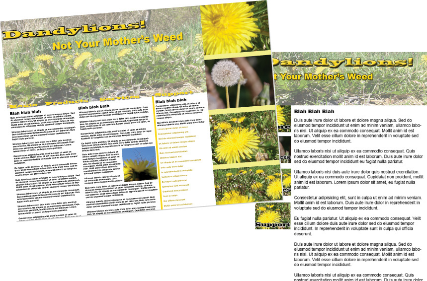
FIGURE 1.2 Desktop and mobile phone versions of the same web page.
In this hour, you’ve learned about the basic features of responsive web design (RWD). You’ve gotten an overview of the techniques used in RWD and found out why RWD is so important.
Q. Isn’t RWD just CSS media queries?
A. In a sense it is, as that is the primary method designers use for creating responsive designs. But there is a lot more to RWD than just media queries, as you’ll discover as you read more of this book.
Q. What about fluid or flexible layouts? Aren’t they important for RWD?
A. Yes, creating layouts that flow with the width of a web browser is a critical part of RWD. This is covered in detail in Hour 12, “Layout.”
1. Visit your favorite websites and check to see if they use responsive design. The easiest way to do this is to simply open your computer browser to the page and then resize the browser down as small as it can go. If the page changes layout or design to better support the smaller screens, then the design is responsive.
2. Choose a website you want to make responsive. You should use this website throughout the rest of the book to practice what you’re learning. I recommend using a website you both own and feel strongly about. This will help you remain committed to learning RWD so that you can improve your site.