
Cascading Style Sheets (CSS) are an important part of mobile web development. In this hour you will learn about how to write CSS and use it to style your mobile pages, including media queries for responsive design to build style sheets for specific devices. You’ll also learn about a few meta tags that will affect how your mobile devices display content.
You use Cascading Style Sheets (CSS) to define how your HTML documents will look. You can style HTML for print, for web pages, and even for specific mobile devices. The same HTML content can also be displayed completely differently in each of those places.
CSS has been around for more than 12 years and is widely supported by most browsers and mobile devices. Therefore, understanding how to use CSS to define how your web applications will look is very important.
CSS is made up of one or more selectors with style properties attached. For example, to change the text color of a paragraph you would write:
p {
    color: red;
}
The selector is p and the style property (enclosed in the curly braces) is color: red;.
To add a second selector, simply separate it with a comma. For example, this assigns the red color to paragraphs and elements with the class redText:
p, .redText {
    color: red;
}
After you have a style, you attach it to a web page in one of three ways:
The easiest way is inline. Styles that are placed inline inside a tag don’t need a selector because the selector is defined by the tag it’s in. You add a style attribute to the tag, and put the styles in the attribute value (separate multiple styles by a semicolon (;). For example, to color the text of a single paragraph red you would write:
<p style="color: red;">
The problem with inline styles is that they only style the tag they are in. So if you needed every paragraph to have red text, you would have to add that style attribute to every paragraph in your document. I recommend using inline styles only for testing. For more efficient and faster loading pages, use embedded or external style sheets instead.
Embedded style sheets sit in the <head> tag of your document. You use the <style> tag and write your styles as mentioned previously with a selector and styles enclosed in curly braces. For example, here is a simple page with paragraphs in red text:
<!DOCTYPE html>
<html>
<head>
    <title>Example of Embedded Styles</title>
    <style>
        p {
            color: red;
        }
    </style>
</head>

<body>
<p>The text in this paragraph would be red.</p>
<p>And this paragraph as well.</p>
</body>
</html>
The problem with embedded styles is that, similar to inline styles, they only put the styles on the page they are on. If you need these same styles in another web page, you have to copy them and paste them into the head of every page you need them on. Only use embedded styles for testing or for small style changes that are only needed on one page.
The best way to add your styles to a document is with an external style sheet. To create an external style sheet:
1. Open a new document in your text editor.
2. Write your styles as in the earlier embedded style sheet example, but without the <style> tag surrounding them.
3. Save that file as a style sheet with a .css extension, such as styles.css.
Here is a style sheet with some additional styles along with the red paragraphs:
External Style Sheets Speed Up Websites
External style sheets, especially if you put all your styles in only one, can speed up the download of your website. After a style sheet has been downloaded, it will stay in the browser cache and not be re-downloaded for other pages on the same site, and the faster your site loads, the better.
html, body {
    margin:0;
    padding:0;
    border:0;
}
body {
    font: 1em/1.25em Arial, Helvetica, sans-serif;
}
p {
    color: red;
}
Writing the style sheet document is not enough; you have to also attach it to your web page. To do this, add a <link> tag to the head of your document that points to the style sheet. For example:
<link href="styles.css" rel="stylesheet">
As long as your HTML file is in the same folder as your style sheet file, it will load all your styles when your page is loaded. Video 3.1 explains how to add a CSS file to your document.
Video 3.1. Creating and Adding a CSS Style Sheet to a Web Page
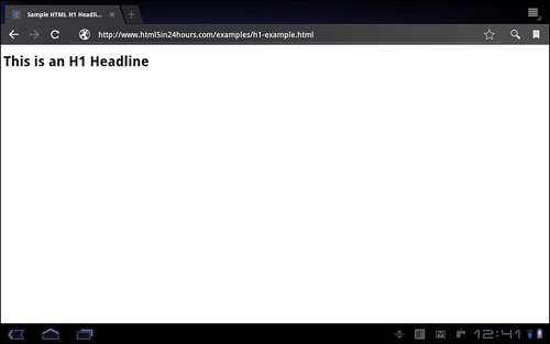
One of the first things that most web designers want to adjust is the fonts used on a web page, specifically the fonts used for headlines. As you can see from Figure 3.1, <h1> headlines, while an important part of most web pages, unstyled tend to be big, bold, and ugly.
Figure 3.1. A sample web page with an <h1> headline displayed on an Android tablet.
You can use several style properties to style the font and text of headlines and other text on your pages, including:
font-family—The face of the fontfont-size—The size of the fontfont-weight—Make the font bold or notfont-style—Make the font italic or notfont-variant—Set small capsfont—A shortcut style to set any or all of the preceding styles in one lineWhile all the preceding properties are good to know, the one that you should focus on is the font property. This, as mentioned, lets you style the majority of font styles all from one property.
The syntax for using the font property is:
font: font-style font-variant font-weight font-size/line-height font-family;
Most of the font styles are straightforward. If you want your text to be italic, you set the font-style to italic, and if you want the text to be bold or 12 pixels high, you add those with the font-weight (bold) or font-size style properties. However, many beginners have trouble with the font-family style property.
Always Include Common Fonts
Some common fonts can be found on most computers. Even if you don’t use these fonts as the first choice in your font stack, using at least one or two is a good idea. Some common fonts include Arial, Helvetica, Comic Sans, Courier, Georgia, and Times New Roman.
When you choose a font for your HTML documents, you have to rely on the font libraries on your customers’ machines. In other words, if you want to use a fancy font like a free font from FontSquirrel.com, you have to hope that your customers have downloaded that font as well. Otherwise, the browser will choose the font, which could cause questionable results.
To ensure that your web page looks the way you want it to, you can use a list of font faces that you want to display, in the order you want them used. This is called a font stack. You can list as many or as few fonts in your stack as you want, but you should always finish the list with a generic font family, as follows:
Video 3.2 explains how to change the fonts using CSS.
Video 3.2. Changing the Font with CSS
Web typography involves more than just fonts, and Hour 11, “Fonts and Typography in HTML5,” goes into more detail on the new HTML5 web typography features.
CSS is an invaluable tool for the layout of web pages, and your layout choices are mostly limited by your imagination. The two basic ways to use CSS for layout are floating and absolute positioning. Floating relies on the CSS property float to place elements with defined widths next to one another, whereas absolute positioning takes elements and places them in precise positions on the page.
To lay out your web pages, you must understand how web pages are built. Every element in your document has a square shape, even if you can’t see it. In fact, the easiest way to see that is to put a border around your elements with the border style property, like this:
border: 1px solid black;
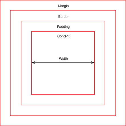
A major part of CSS layout surrounds the boxes that are created by the elements. In fact, it’s so important that it’s called the CSS box model. Every box on a web page has a content area, padding, a border, and a margin. In Figure 3.2, you can see how those parts fit together. With CSS you can affect the width or thickness of all of them.
Figure 3.2. The CSS box model.
To change the box model with CSS, you can use these style properties:
marginpaddingborderheightwidthAfter you have defined the box model on your web page elements, you can use CSS floats to position your elements where you want them on the page.
Video 3.3. Laying Out an HTML5 Web Page
1. Build your HTML5 document:
<!DOCTYPE html>
<html>
<head>
<title>Page Title</title>
</head>
<body>
<header>
<h1>Page Title</h1>
</header>
<nav>
<ul id="">
<li><a href="#">Home</a></li>
<li><a href="#">About Us</a></li>
<li><a href="#">Products</a></li>
<li><a href="#">Services</a></li>
</ul>
</nav>
<article>
<p>This is the text of the article.</p>
</article>
<footer>© 2011</footer>
</body>
</html>
2. Set the width on the body element with CSS in the <head> of your document:
<style>
    body { width: 100%; }
</style>
3. Clearing the borders, margins, and paddings on the body tag is also a good idea.
body {
    width: 100%;
    margin:0;
    padding:0;
    border:0;
}
Get in the Habit of Resetting Styles
Most browsers set defaults on things such as margins, padding, and so on, and those defaults aren’t all the same. If you want your web pages to look similar on different browsers, you need to start with a clean slate. The best way is to use a “reset” style sheet. You can find an excellent CSS reset style sheet at Eric Meyer’s site: http://meyerweb.com/eric/
tools/css/reset/.
4. Set the width of the header and footer to 100% as well:
header { width: 100%; }
footer { width: 100%; }
5. Set the width of the navigation element (<nav>) to 38% and the article to 62%:
nav { width: 38%; }
article { width: 62%; }
6. Float the navigation to the left:
nav { width: 38%; float: left; }
7. Clear the float on the footer, so that it doesn’t float next to the navigation by mistake:
footer { width: 100%; clear: left; }
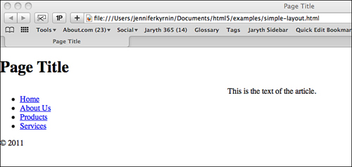
The full HTML and CSS looks like this:
<!DOCTYPE html>
<html>
<head>
<title>Page Title</title>
<style>
body { width: 100%; margin:0; padding:0; border:0; }
header { width: 100%; }
nav { width: 38%; float: left; }
article { width: 62%; }
footer { width: 100%; clear: left; }
</style>
</head>
<body>
<header>
<h1>Page Title</h1>
</header>
<nav>
<ul id="">
<li><a href="#">Home</a></li>
<li><a href="#">About Us</a></li>
<li><a href="#">Products</a></li>
<li><a href="#">Services</a></li>
</ul>
</nav>
<article>
<p>This is the text of the article.</p>
</article>
<footer>© 2011</footer>
</body>
</html>
Figure 3.3. A simple layout displayed in Safari.
Listing 3.1:
CSS3 is the latest version of CSS. Unlike previous versions, it is being released in modules. Modules are available for color, selectors, backgrounds and borders, and so on. These modules are at all stages of the standards process, but many web browsers provide support already.
CSS3 offers many great new features:
Support for CSS3 style properties isn’t always as straightforward as learning a list of new properties. Most web browsers add new styles in with keywords at the front of the property to indicate that it’s a browser-specific property. These keywords are
-moz—Firefox and Mozilla-ms—Internet Explorer-wap—WAP and Opera-o—Opera-webkit—Chrome and SafariYou can use many of the new CSS3 properties right now, as long as you include the corresponding browser-specific extensions.
Rounded corners in CSS3 are achieved with a property called border-radius. Nearly every designer in the world has been waiting for this style to have better support because the blocky, boxy look of CSS2 web pages has gotten boring. In fact, until this style came along, designers were forced to use awkward HTML structures, images, and even tables to get rounded corners.
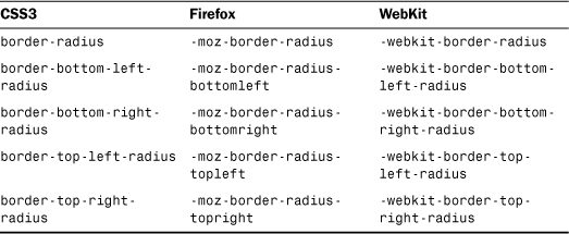
As with the font property discussed earlier, you can style all four corners with the shortcut property border-radius or you can set the curve on specific corners with styles for each corner:
border-bottom-left-radiusborder-bottom-right-radiusborder-top-left-radiusborder-top-right-radiusThe border-radius properties are well supported by modern browsers. You can use the CSS3 values in all instances unless you are writing for extremely old versions of Firefox or iOS/Safari. But it’s a good idea to include the extensions for backwards compatibility. Table 3.1 shows the CSS3 properties and their browser-specific extensions. Be sure to test in the browsers you support, because the modern versions of Chrome, Firefox, and Safari don’t need the extensions. Even Internet Explorer 9 and 10 support this property.
Table 3.1. Border-Radius Browser Extensions
To use the border-radius styles, you set the length of the radius for the border. You can create a rounded corner by using one length value, and an elliptical corner by using two values.
Video 3.4. Building a Box With Different Corner Styles
1. Open an HTML5 document and add in a <div> with a short paragraph of text inside it:
<div>
    <p>Here is a short paragraph of text.</p>
</div>
2. Give your <div> tag an ID so it can be styled uniquely with the CSS:
<div id="all-four">
3. Create a new style sheet and give the <div> a background color, border, width, and height:
#all-four {
    background-color: yellow;
    border: solid black 2px;
    width: 200px;
    height: 200px;
}
4. Style the top-left corner with a round corner, and don’t forget to put the browser extensions first, and the CSS3 property last:
-moz-border-radius-topleft: 25px;
-webkit-border-top-left-radius: 25px;
border-top-left-radius: 25px;
5. Style the top-right corner with an even ellipse (which is the same as a rounded corner):
-moz-border-radius-topright: 65px;
-webkit-border-top-right-radius: 65px;
border-top-right-radius: 65px;
6. Give the bottom two corners uneven ellipses:
-moz-border-radius-bottomleft: 100px 50px;
-webkit-border-bottom-left-radius: 100px 50px;
border-bottom-left-radius: 100px 50px;
-moz-border-radius-bottomright: 135px 25px;
-webkit-border-bottom-right-radius: 135px 25px;
border-bottom-right-radius: 135px 25px;
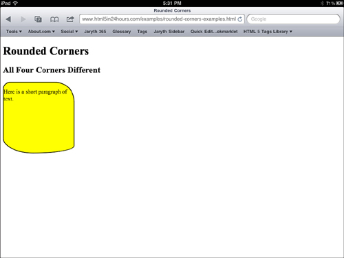
Figure 3.4. A div with different types of rounded corners, on an iPad.
Listing 3.2:
You can add shadows to text and boxes using the CSS3 properties text-shadow and box-shadow. The format for these styles is:
text-shadow: horizontal-offset vertical-offset blur-radius color;
box-shadow: horizontal-offset vertical-offset blur-radius color;
The offsets are the amount that the shadow should be offset from the original element. The blur radius is the amount of blur to be applied; the color is the color of the shadow.
Video 3.5 shows you how to apply box shadows, text shadows, and transparent colors, which you learn more about in the next section.
Video 3.5. Applying Box Shadows, Text Shadows, and Transparent Colors
CSS can display colors as RGB with the format rgb(r,g,b) where the r, g, and b are numbers from 0-255 for the colors red, green, and blue. For example rgb(0,0,0) is the color “black.” CSS3 adds support for RGBa, so you can define the opacity as well. This means you can create more interesting designs with background colors that are semi-transparent. To use RGBa, add a fourth number between 0 and 1 to the end of your RGB code. 0 is transparent and 1 is 100% opaque. For example:
rgba(0, 0, 0, 0.5)
This creates a color that is black, but 50% transparent.
CSS3 is well supported by modern smartphones and tablets that use WebKit- and Opera-based browsers. Both Android and iOS devices as well as Windows 8 phones support many elements of CSS3, but older phones might have trouble with these styles.
Also, mobile devices using versions of Windows older than Windows 8 may not have good CSS3 support. Internet Explorer has not had good CSS3 support until version 9, and the mobile versions of this browser are just as bad.
When you’re using CSS3, be sure to always place browser extensions first with the CSS3 property last for the broadest support, and always test in as many browsers as possible when you’re using a style you’re not familiar with.
In this hour you learned how to write CSS styles, choose the best way to add those styles to a style sheet, and attach that style sheet to your HTML. You learned how to style the fonts and layout of your web page as well as how to use fancier CSS3 properties for creating shadows, rounded corners, and transparent colors.
Mobile devices provide good support for CSS3 properties, especially the more modern smartphones and tablets. If you are building HTML5 web applications, using CSS3 is a natural adjunct.
Q. I want to use special fonts for my header, but since I can’t be sure that my customers have the font, should I just use an image instead?
A. Every website is different, but using an image for fonts is generally not a good idea. They increase the time needed for your page to download and can be difficult for screen readers to process. They are also not search engine–friendly. But you shouldn’t give up. Ways exist to get your fancy font onto the page. You can use image replacement techniques or embed fonts using web fonts (discussed more in Hour 11). But for now, you can put that font first in your font stack.
Q. Are there other CSS3 properties that I can use?
A. This book does not cover many CSS3 properties, but there are a lot more that are supported by modern browsers both with and without extensions. You can use some properties to help you create magazine-style layouts with columns. You can create borders with images using the border-image style. You can create transition effects with the transition property. If you’re worried that the properties you want to use won’t work with some browsers or devices, you can discover compatibility tables at the site “When can I use...” (http://caniuse.com/).
Q. I’ve read that Internet Explorer doesn’t handle the CSS box model correctly. What should I do about that?
A. This is partially true. Internet Explorer 5, 6, and 7 all implemented the CSS box model slightly differently than other, more standards-compliant browsers. These versions of IE did things like double the padding when you float an element inside another and count the padding as part of the width of the element, rather than adding it on. You can find hacks online to fix these problems, but luckily Internet Explorer 8 and beyond was brought into compliance with the standards, and so you should only see these issues in older browser versions.
float and setting the width of your elements.text-shadow or box-shadow.