
Responsive web design (RWD) came about because of mobile devices. Before RWD existed, web designers had few options for creating a website that worked reliably on both small devices like cell phones and large screens like HD monitors. You could use the tools described in Hour 2, “Alternatives to Responsive Web Design,” but they were never intended for the vast number of changes that mobile devices added to the landscape.
Designers used to often design pages which assumed that if a browser is “modern,” it should support all modern HTML, CSS, and JavaScript (or DOM) features. But mobile browsers often don’t support all the features that modern computer browsers do.
In this hour you will learn more about the basic differences between mobile devices. There is more to mobile design than just responsive design. You will also learn more about how to support specific devices.
Just a few years ago, most people with cell phones had basic cell phones. And while basic phones are not as popular in the West, there are still a lot of countries in the world where simple cell phones are still popular. But many web designers completely discount them.
These phones have the following features:
Basic cell phones often use web browsers that were built for them by the company that sells the phone. This means there isn’t a lot of information about what the browser can and cannot support. The Opera Mini browser is the browser most commonly used with these phones. And as of August 2014, Opera Mini still had 3.7% of the worldwide mobile browser market, according to NetMarketShare (http://www.netmarketshare.com). That same site said that the market share for other or unrecognized phone browsers was 1.26%.
While the share of Opera Mini and unrecognized browsers has been dropping over the past year or two, 4.96% is still a lot of people on a lot of phones. When you then look at what Opera Mini seems to support on sites like CanIUse.com (http://caniuse.com), this number takes on greater significance. And smart web designers consider these users when building their sites.
There are many things you can do to support basic cell phones on your website beyond RWD. These are some of the things that I like to do:
The trick to supporting basic cell phones is to keep the sites you build as simple as possible.
Video 3.1. Web Pages Look Different on Different Devices
Smartphones are growing in popularity every day, and more and more people are using smartphones to access the web. In fact, many people would argue that smartphones are the reason we need RWD.
The best thing about most smartphones is that they use browsers that have good support for modern technology like HTML5 and CSS3. They aren’t as large as laptop or desktop computers, but they often have the resolution required to display web pages just as effectively. Table 3.1 shows the resolutions of popular smartphones.
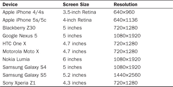
TABLE 3.1 Resolutions of Popular Smartphones (in Early 2014)
When you’re planning an RWD site, you should consider both the screen size and the resolution of the devices you’re targeting. For example, if a device has a high resolution but a small screen size, even though you can fit a multicolumn layout on the page, it might have text that is completely illegible on the small screen.
Smartphones are much easier to support than basic cell phones because they have much more sophisticated browsers. But there are still things you need to be aware of when you’re designing for smartphones:
Tip: Some Form Fields Are Ideal for Smartphones
HTML5 brought a lot of new features to HTML, and some of the best new features are related to form input fields. Now web designers can write forms that are easy to fill out even on a small-screen smartphone or tablet. And best of all, these form fields work no matter what browser or device your customers use. I cover this in more detail in Hour 18, “Responsive Web Forms,” but here’s the basic secret: If you start using the <input type="email"> for email addresses and <input type="tel"> for phone numbers in your contact forms today, you will improve them immensely. When you use these two fields on a smartphone or tablet, the input keyboards adjust so that the forms are much easier to fill out. But a customer using even an extremely old browser like Netscape 6 will still see just a text field and will be able to fill it out without issue.
If you’re going to support smartphones, then you should remember that they are not just miniature computers.
Tablets and tablet computers are where mobile devices have really taken over. Consumers are buying more tablets than they are desktop and laptop computers, and if your website doesn’t work on a tablet, you will be in trouble.
Luckily, the tablets on the market now use web browsers that are just as compatible with HTML5, CSS3, and JavaScript as their desktop computer counterparts. But that doesn’t mean you should treat these devices just like computers.
Like smartphones, tablets have different screen sizes and resolutions, and these can impact your designs, so you need to take them into consideration. Table 3.2 lists some of the popular tablets and their screen sizes and resolutions.
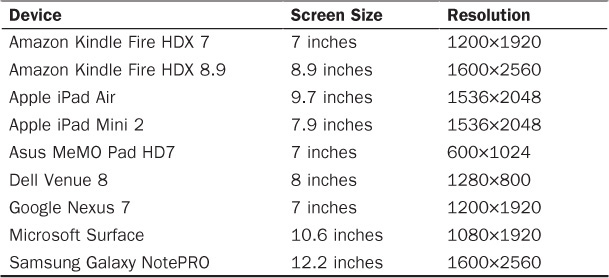
TABLE 3.2 Resolutions of Popular Tablets (in Early 2014)
As with smartphones, the range of sizes and resolutions varies greatly on tablets. When you’re a web designer, it can be tempting to simply assume that if a device has a resolution of more than 1000px wide, it should be able to display web pages without any problem. But there are some aspects of tablets that you need to be aware of:
Caution: Scrolling Clickable Banners Can Be Extremely Annoying
A very popular feature on web pages right now is the rotating banner image or carousel. These are clickable images that showcase a featured part of the site. On desktop computers where the pages load very quickly, these work really well. But a common problem on tablets is that pages load more slowly, but the rotation on the banner continues. So when a customer clicks on such a banner, the page continues to load, rotating that banner out and the new banner in. The customer ends up at a page other than the one she wants. If you must use these types of banners, it’s best to either give them a very long rotation period (like 60 seconds or more) or to allow customers to rotate them manually.
Many people use tablets as their primary web browsing device, and if your web pages aren’t tablet ready, you will lose customers.
Retina devices are a special subset of Apple iPhone and iPad devices. A Retina display has a much higher pixel density than other computer screens. The density is roughly 300 pixels per inch, which is comparable to the density of a print document.
Apple first introduced Retina displays in the iPhone 4S in 2011. And since then, Apple has come out with Retina iPads and Retina laptops as well as the iPhones. Retina-like screens will probably start coming out for non-Apple devices sometime in 2014.
This means that anyone using a Retina device to view a website that is not optimized for Retina displays will see images that seem fuzzy or blurry. In some cases, the pixels will be visible, such as in a rounded corner or on transparent edges. Pixels are square, and rounded edges where you can see the pixels make those edges look square and blocky, too.
As I mentioned above, a website that is not Retina-ready can look blurry and pixelated on a Retina screen. Pixelation may not be obvious to a non-designer, but the reality is that even if users don’t know they are seeing it, their brains do. When a picture is blurry or pixelated, your customers will need to spend more effort to see the page. And this can be tiring. For example, I am prone to migraines, and I notice that if I spend a lot of time on non-Retina-ready sites, I’m much more likely to get eye strain and then a migraine. Websites should not cause their customers pain.
These are some of the reasons to build Retina-ready pages:
The majority of work you need to do to get a website Retina-ready involves the images. You want to create images that are at least 220ppi and often twice as large as their non-Retina counterparts.
An easy way to include these images only for your Retina customers is to use the retina.js script, which you can find at http://retinajs.com. Then you simply create a graphic and give it a name like image.jpg and then create a Retina version of that graphic and name it image@2x.jpg. When a Retina user visits your page using the retina.js script, the images are automatically replaced with the Retina versions. I discuss this in more detail in Hour 15.
Responsive design is very important to mobile customers because it allows them to see the same website that non-mobile customers see. Before RWD came along, web designers would often create entirely separate sites for mobile customers, which were typically subsets of the full site.
RWD allows designers to create sites that work on many different devices without requiring them to repost the content multiple times.
The thing to remember is that mobile use and the use of different devices to view web pages is growing and, according to some measures, the use of mobile devices will surpass or already has surpassed desktop use. There are already a lot of people who only go on the web using mobile devices.
RWD lets you as a designer build a website that doesn’t care what device your customer is using. Rather than having to build a site for mobile, a site for desktop, and a site for smart appliances, you build just one site that is flexible enough to support all those devices and more.
And RWD is more future-proof than standard web design. RWD doesn’t look at a device but rather looks at the features. For instance, an RWD site that checks for Retina displays doesn’t care if the device is an iPhone 4S or a Google Nexus 11. It just notices that the screen can handle high-resolution Retina images and displays those.
Many people believe that RWD is not a trend but rather the way websites will be built. The expectation is that a site that isn’t responsive by 2015 will be considered behind the curve and will lose customers.
Video 3.2. How a Responsive Design Looks
This hour you’ve learned about the different devices that RWD tries to respond to. You’ve learned how to support basic cell phones, smartphones, and tablets. And you’ve learned how Retina screens are impacting the mobile device landscape.
Q. I don’t know anyone who browses using a basic cell phone. Is it really important to support those devices?
A. The answer really depends on your website and who your customers are. For some websites, basic phones are a nonexistent part of the customer base, but for others they are critical. If you don’t know, rather than make a guess, you should watch your stats and see who is visiting your site.
When you’re looking at your site stats, bear in mind that if your site focuses on a lot of people from undeveloped countries, you need to support their greater use of basic cell phones.
Also, your site’s topic can have an impact in this area. For instance, I work on a site that is visited by a lot of people who don’t like modern technology. The site’s customers are all from North America, but they tend to use more basic cell phones than do users of my site about HTML5.
Q. Is Retina-ready really as critical as you say? Most of my mobile customers are on Android devices.
A. Again, this is a factor that you’ll need to decide based on your site’s customers. A good tool to use to find out if you’re being visited by a lot of Retina devices is Google Analytics (www.google.com/analytics/). After you know how many people are seeing your site as pixelated and blurry, you can make a better decision.
Using a basic cell phone, smartphone, or tablet—or all three if you have them—visit the website you chose in Hour 1, “What Is Responsive Web Design?” Evaluate how the site looks in the device. Does it work well? Is it easy to use? What can be improved?